Flow Yoga Studio
Flow Yoga Studio needed an identity that didn’t just reference movement, but lived it. I designed the brand to reflect a natural sense of motion, something that feels grounded, quiet, and continuous.
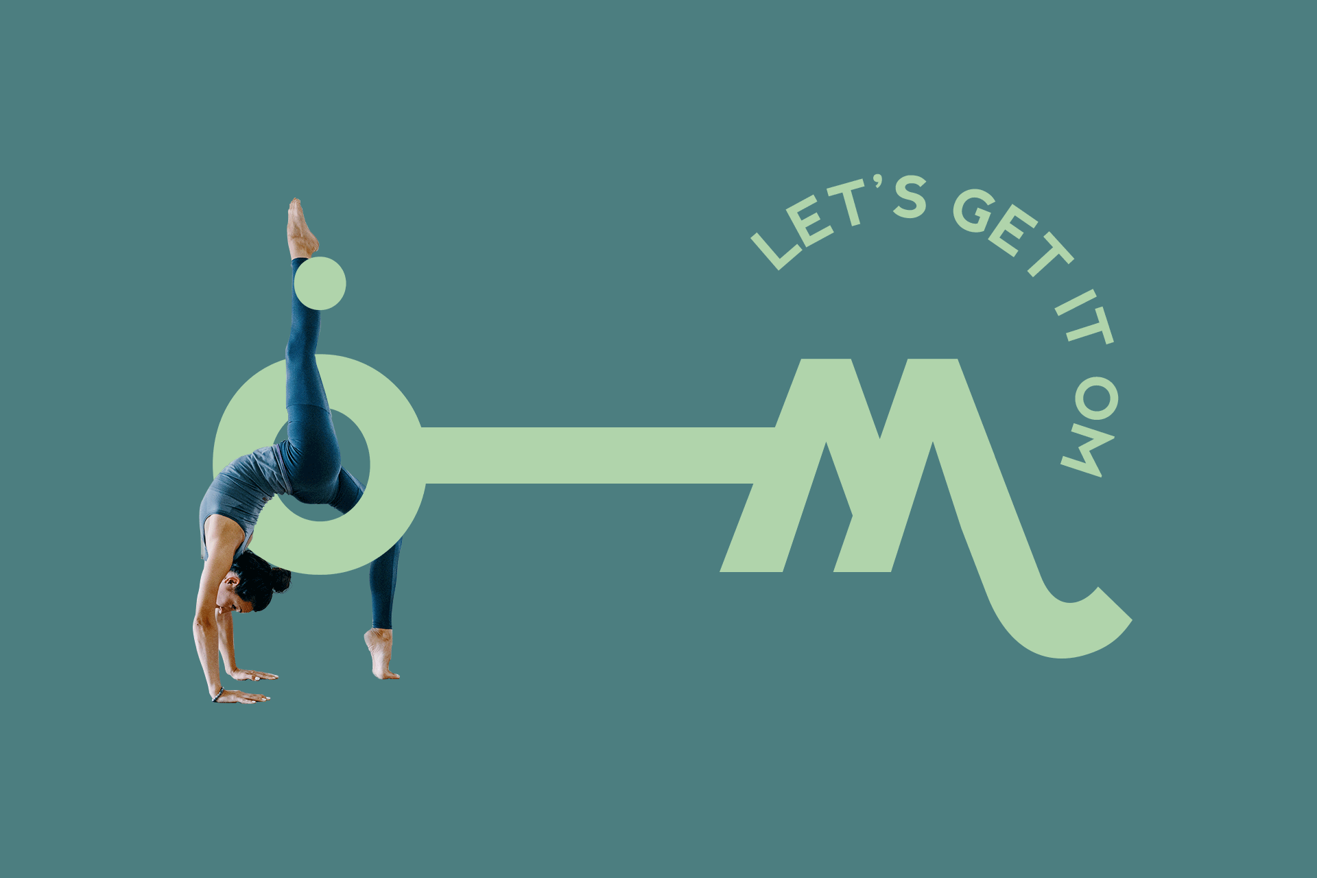
The brand treats “flow” as something natural, not a graphic trick. While working on the wordmark, I noticed the shape of “OM” was already hidden in the letters of “Flow.” Instead of adding new symbols or illustrations, I chose to highlight that subtle connection. The idea lives inside the word itself, not as a decoration on top of it.
The identity leans into clarity, simplicity, and intention. Every decision supports the studio's experience rather than competing with it. The system is minimal, not for aesthetics alone, but to preserve space for the practice and its philosophy to take the lead.
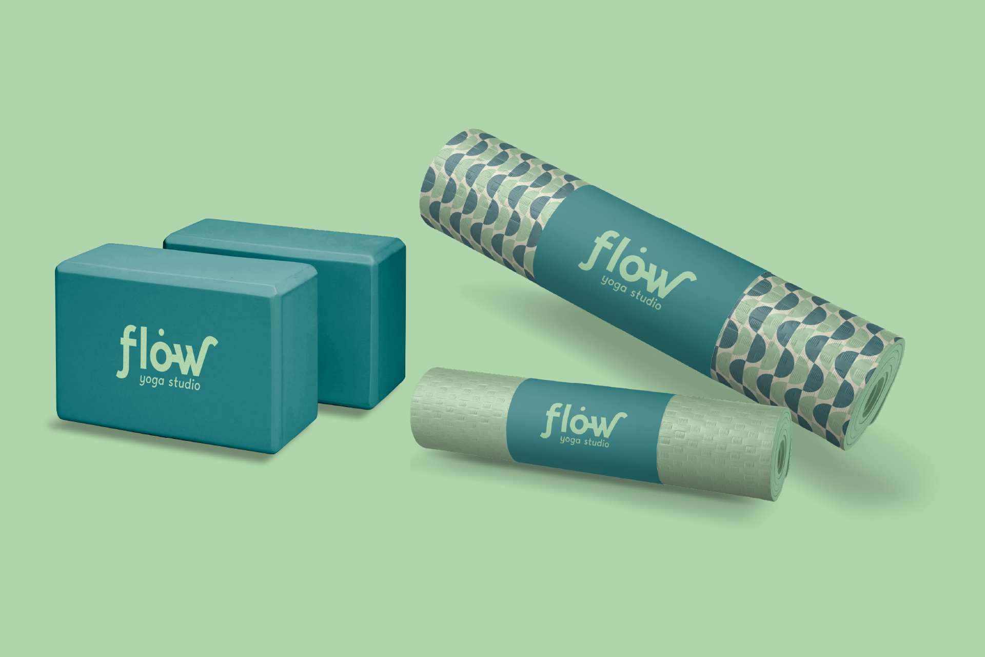
I directed the palette toward tones that feel steady and supportive. The colors create a sense of calm without losing energy, encouraging focus while keeping the space approachable and human.
Thin, curving geometric letterforms with generous spacing introduce a quiet sense of motion. I paired these shapes with a mix of soft pastel hues and deeper analogous tones to echo the balance found in yoga: grounded, breathable, and continuously flowing.
The final identity offers visual space to think, breathe, and move. Nothing is imposed. Nothing distracts. The brand supports the practice by reflecting it, allowing Flow Yoga Studio to feel as natural and intentional as the movement it teaches.